alphabet
Alphabet
2022


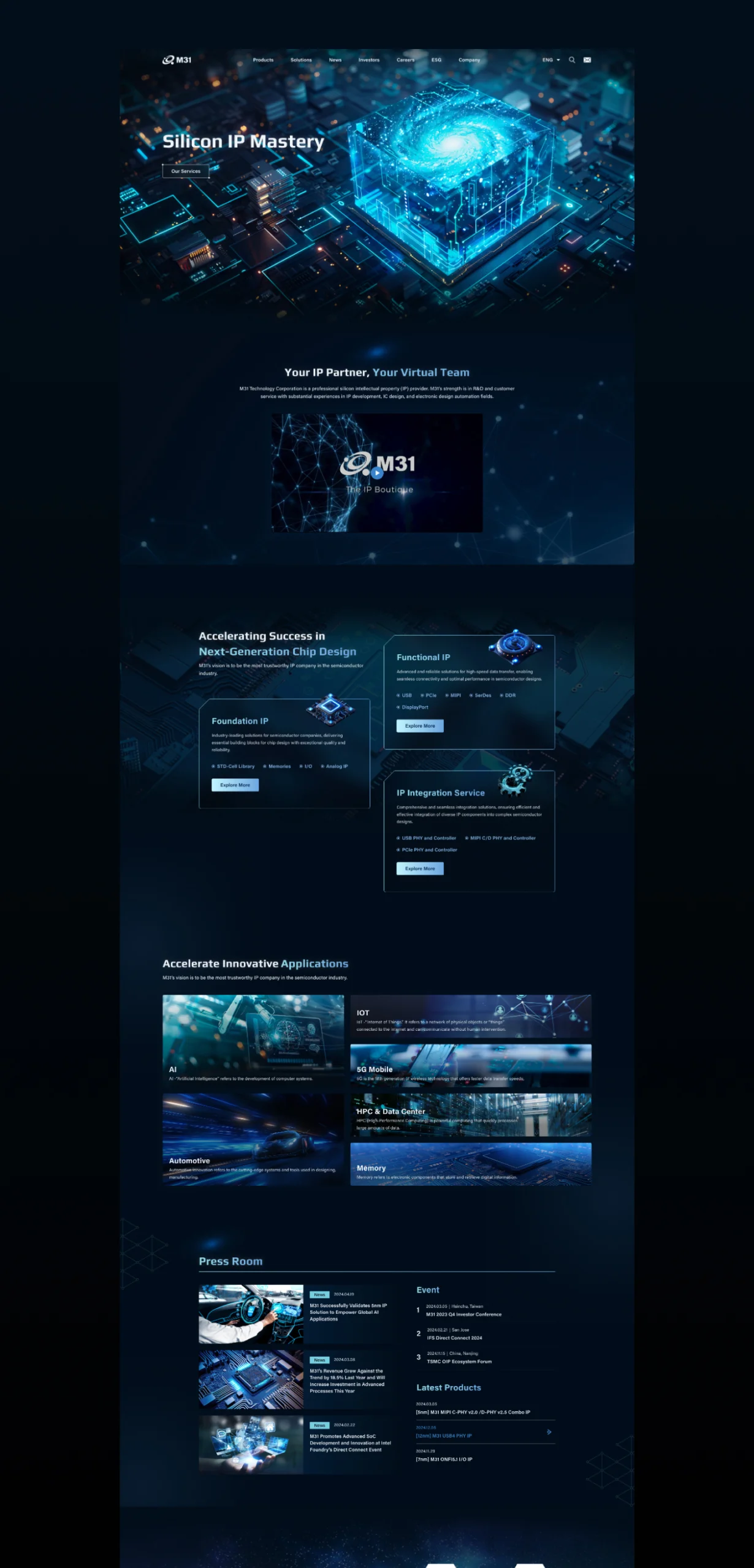
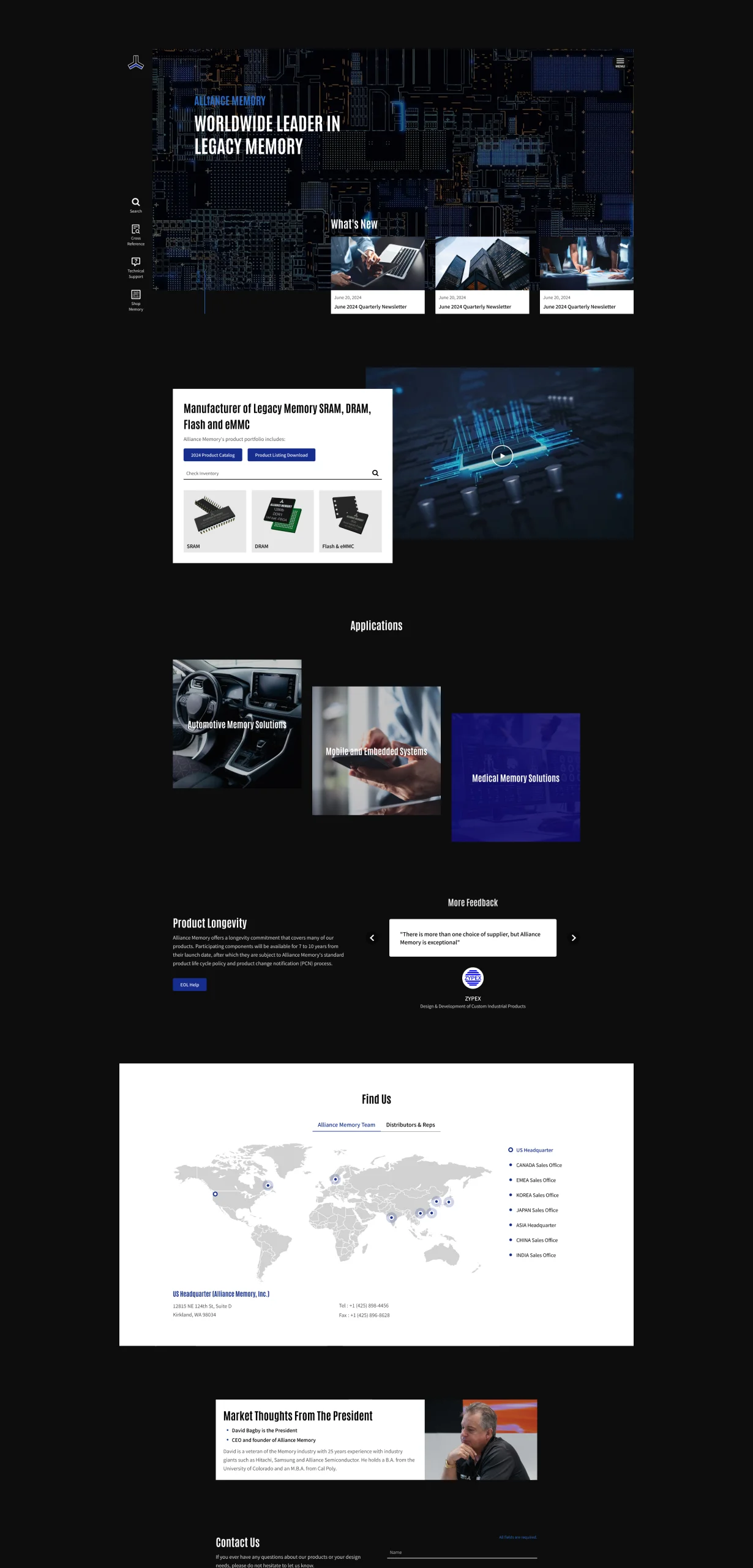
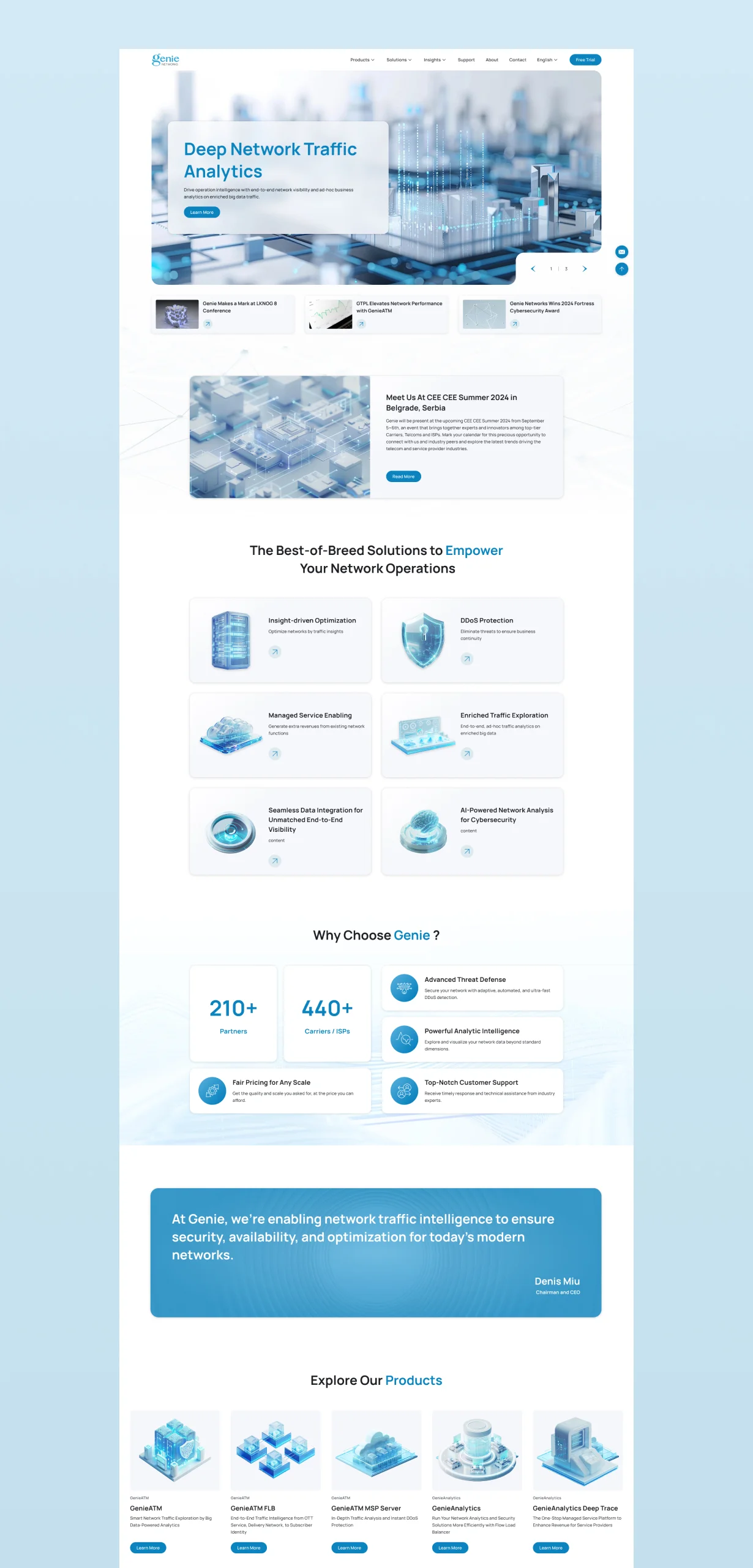
Corporate Identity Website
WordPress
Brand & Consumer
Website Planning, Website Development, Traffic Analysis, User Behavior Analysis, SEO


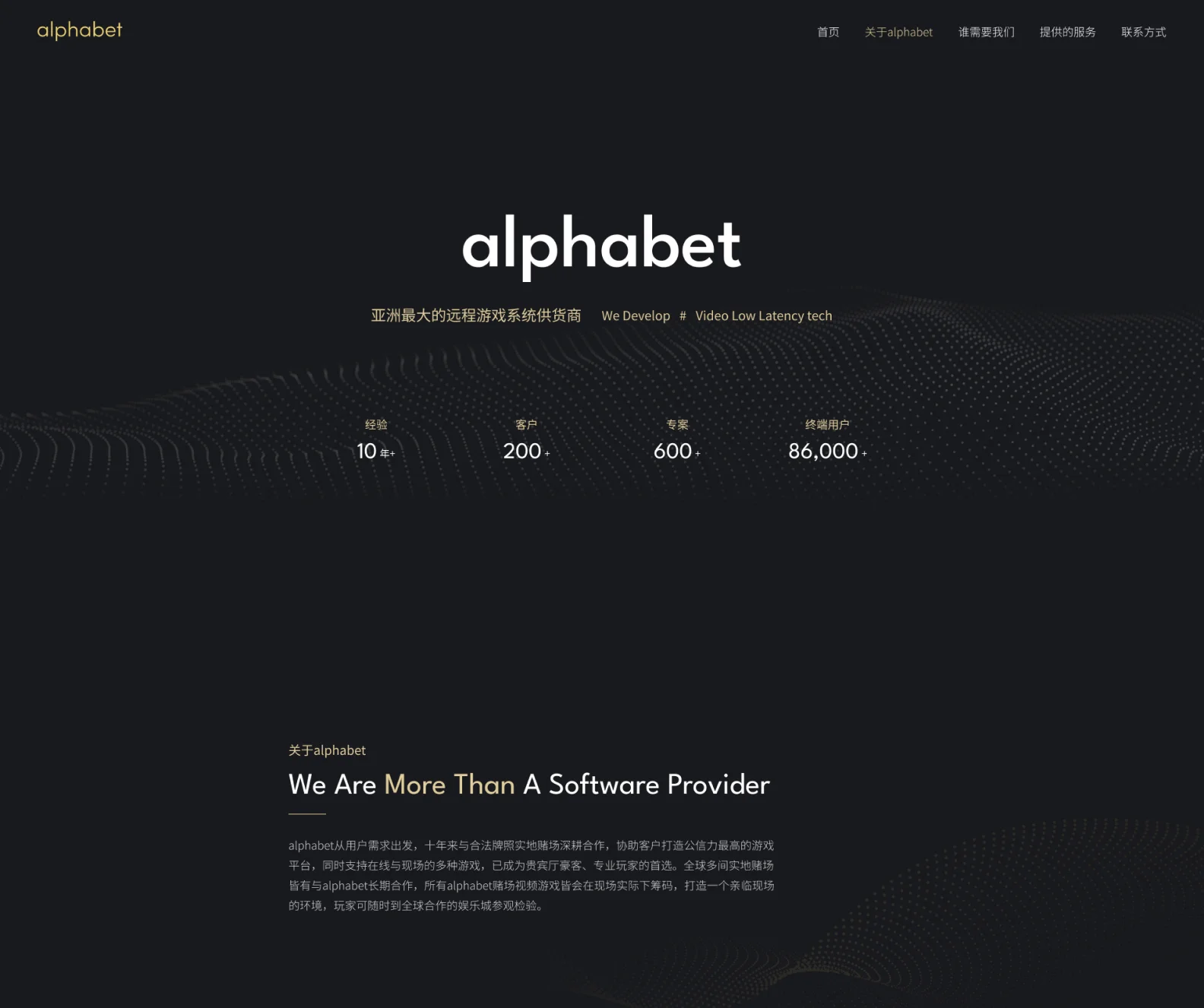
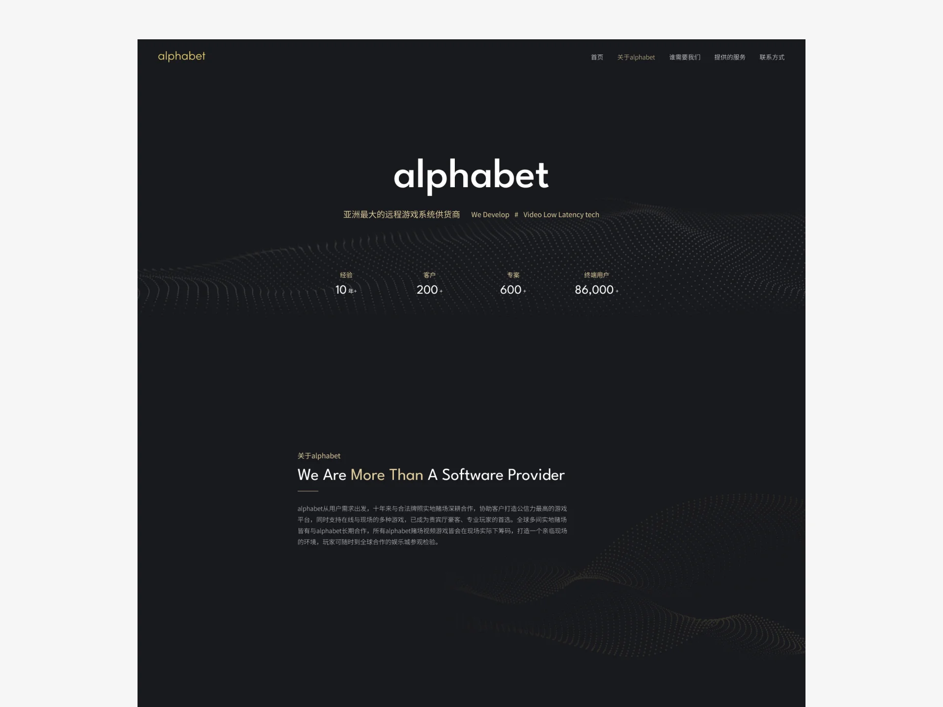
Starting from user needs, alphabet has spent ten years working closely with licensed land-based casinos to help clients build the most credible gaming platform, supporting a variety of online and on-site games, and has become the first choice of VIP-room high rollers and professional players. Many land-based casinos around the world work with alphabet long term, and all alphabet casino video games place bets on site in real time, creating a live environment where players can visit partner entertainment venues worldwide at any time to verify.
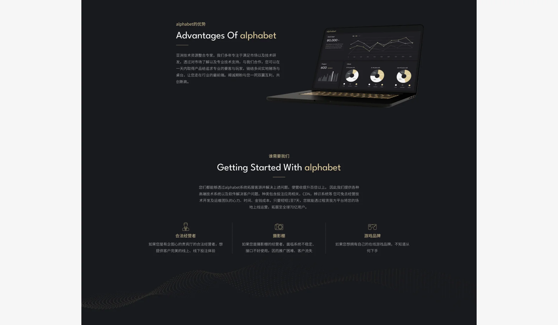
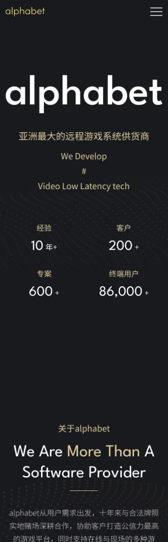
The overall design centers on a black base with golden glow accents, creating a night-city atmosphere that is understated yet glamorous. The visual theme blends tech and 3C imagery to convey the energy and futurism of “gaming,” echoing the concept it represents. The layout uses a clean, strong structure for a steady, grand image, while delicate lines and light-and-shadow touches in the details keep the screen from being monotonous and add refined, high-quality layers. The overall style shows a perfect union of modern urban feel and gaming spirit, creating a distinctive identity.


OUR STRATEGY

Content Architecture
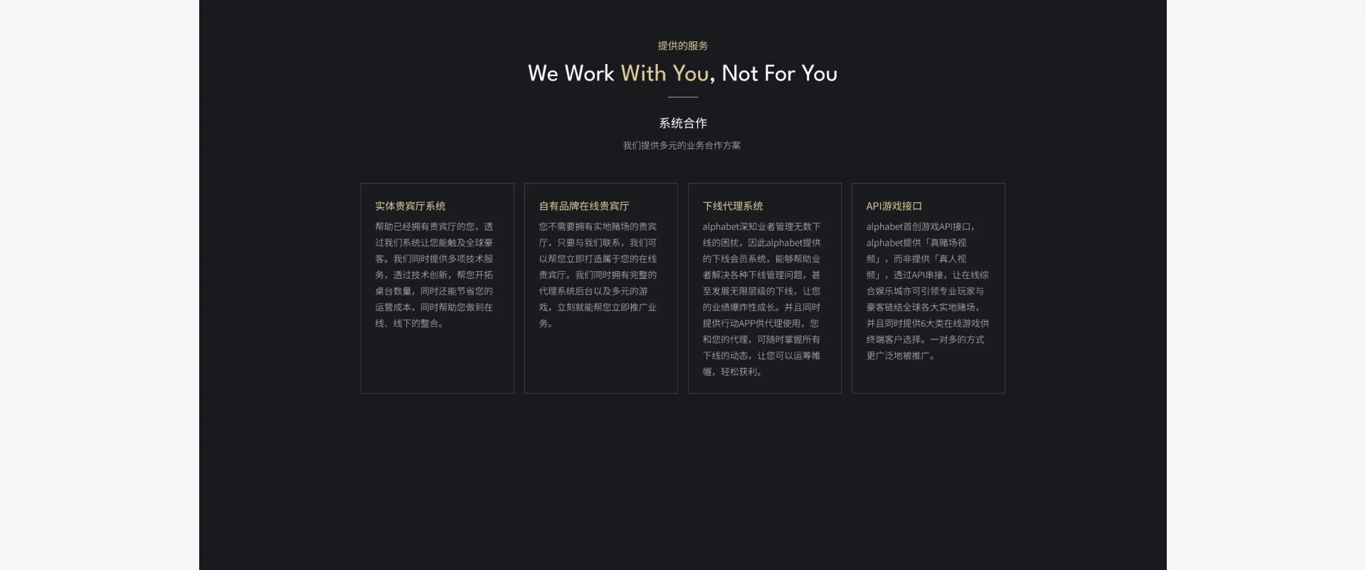
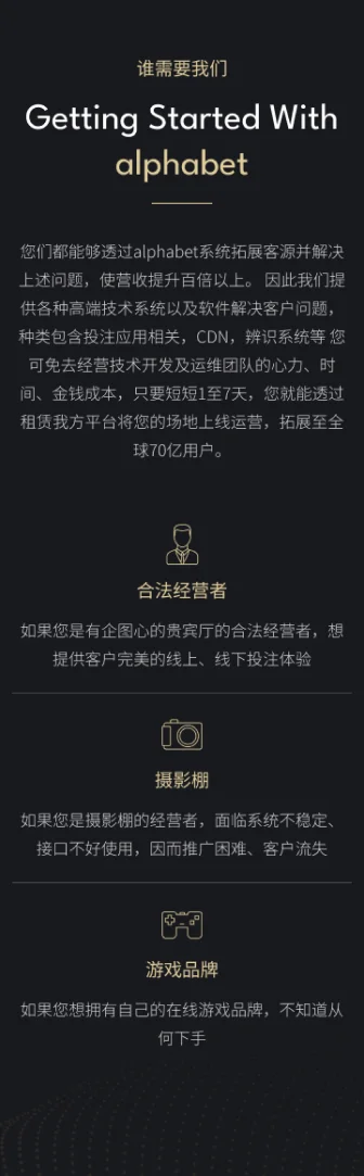
The content flows clearly from the homepage (Home), About, Who Needs Us, What We Offer, to contact details. Each section first explains “who we are / what we do,” then “what problems we solve for you / which clients we suit,” and finally presents specific services. The copy emphasizes benefits (such as savings in cost, labor and time), with data and cases showing prospects the value of working together. Images and text alternate so the visuals are neither monotonous nor too busy.

Layout Planning
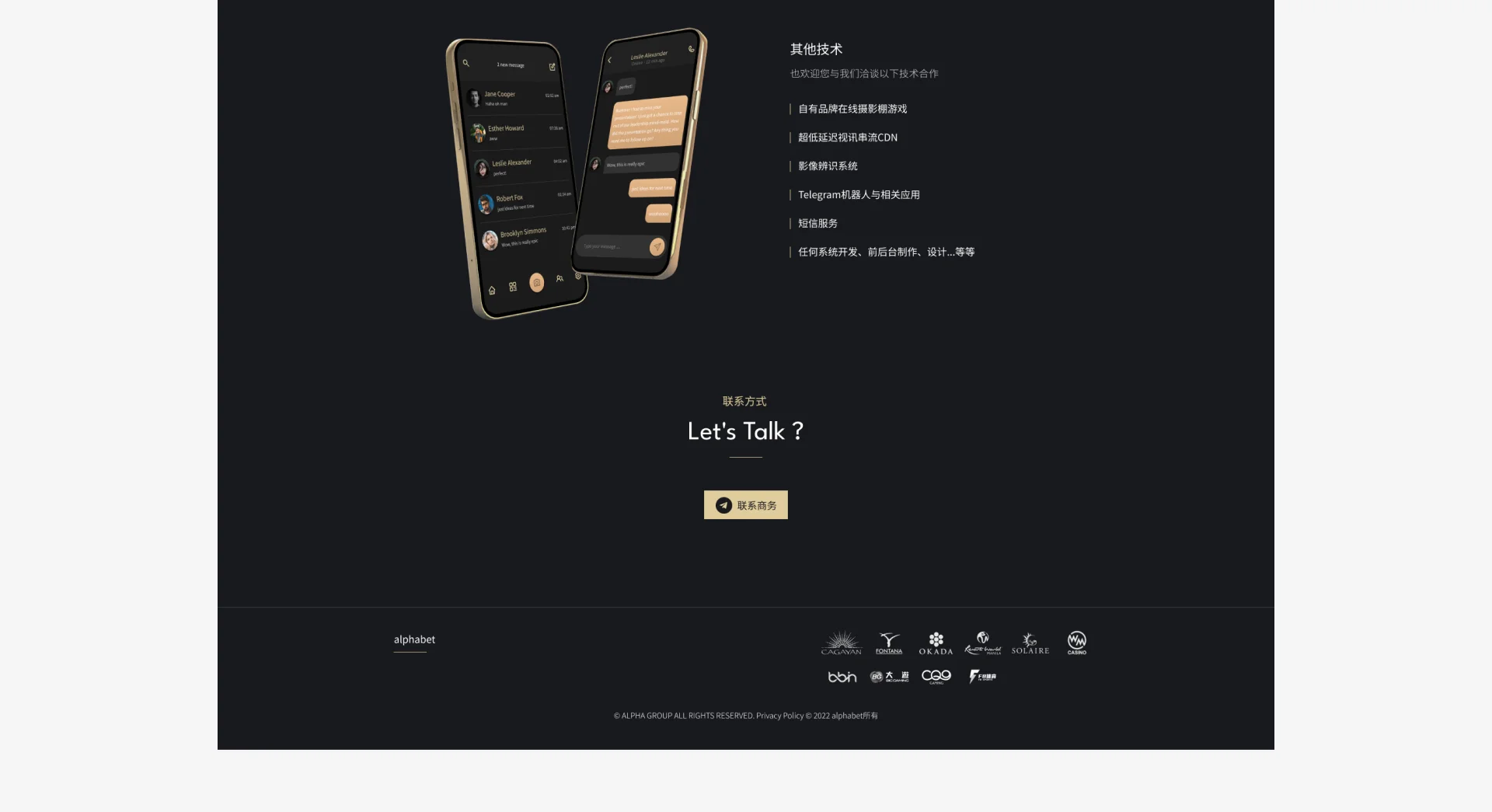
The layout uses full-width banners, image backgrounds and emphasized headline text for strong visual impact. Blocks are divided in a simple, clear grid (for example: who needs us, services provided, contact), giving information clear hierarchy. The navigation bar is fixed at the top with concise, direct menu items. Call-to-action buttons (such as “Contact Sales”) are prominently placed. The spatial arrangement is balanced with a moderate image-text ratio and whitespace so users never feel crowded or lost.

SEO
The site has a clear navigation structure so search engines can understand its architecture. Although no obvious image alt text is visible, the combination of images and text is positive for SEO overall. Room for improvement lies in adding ongoing content such as a blog or case studies to attract organic traffic, and doing more long-tail keyword optimization in metadata (such as title and description tags) to improve visibility across different search intents.
Seamless Experience On Mobile Devices
We use a Mobile-First design that starts from user habits and builds an intuitive interface for mobile devices, optimizing tap targets, layout and performance to ensure a consistent, smooth brand experience on every device.
Selected Cases
WORK