Sinyi Realty Malaysia Website
Sinyi Malaysia
2017
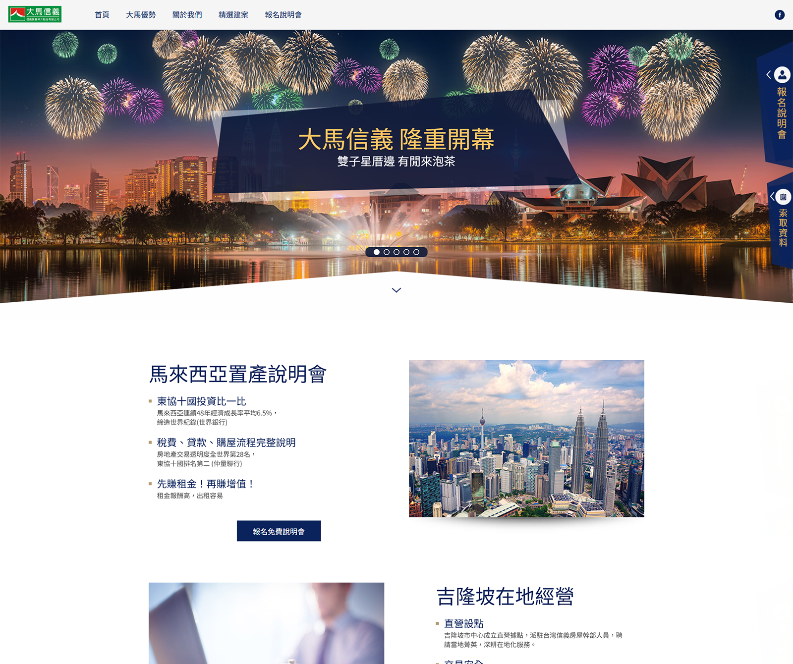


Corporate Identity Website
No backend
Real Estate Living
Website Planning, Website Development, Traffic Analysis, User Behavior Analysis, SEO

Delta Electronics was founded in 1971 with the mission “environmental protection, energy saving, loving the Earth,” and is a global leader in power management and thermal solutions. Delta continues to use its core technologies to provide efficient, reliable integrated solutions for transportation, automation, infrastructure and more. In recent years it has actively transformed into a system integration solutions provider to address climate change and advance sustainable development.
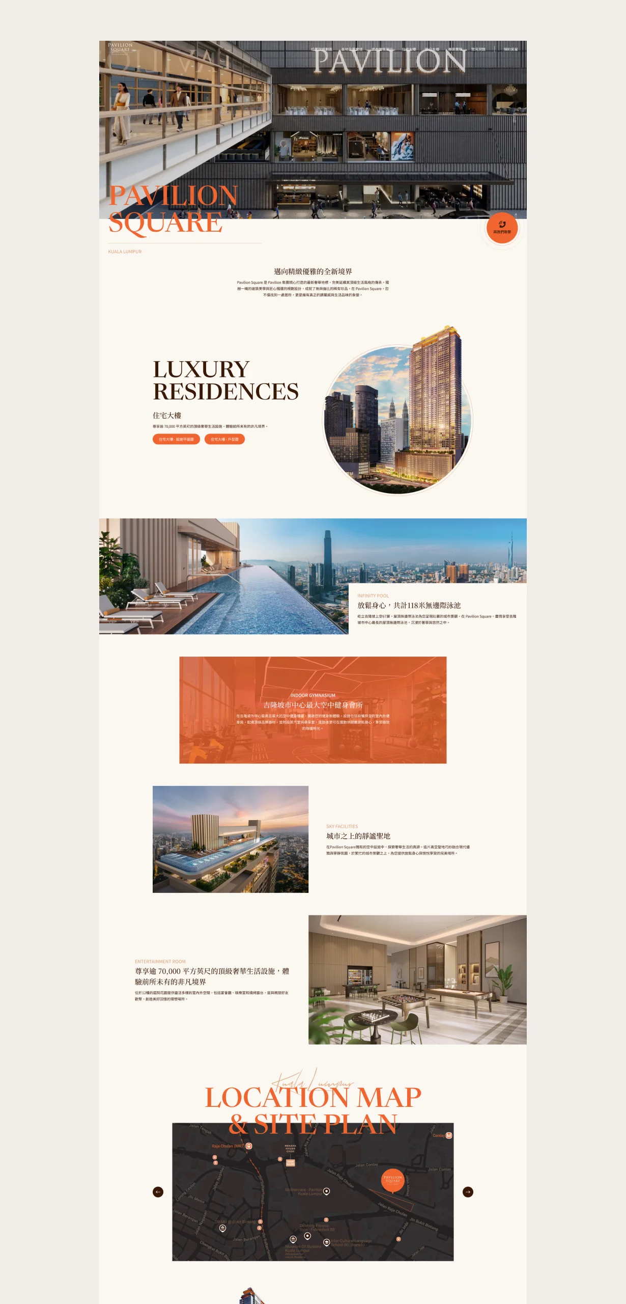
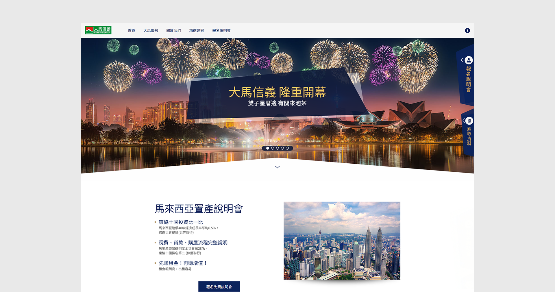
Centered on “professionalism × steadiness,” high-quality imagery and a calm, refined visual language shape a trustworthy corporate brand image. The overall style stresses clear structure and restrained color to convey the company’s steady attitude and professional spirit in the industry. In visual strategy, high-resolution, textured photos are the main focal points so every screen has visual persuasion and brand warmth. Images do more than decorate; they carry corporate values and atmosphere, letting users feel the brand’s professional conviction and integrity at first glance. The site architecture follows clarity as its principle, dividing information by function and user needs, concentrating key content and simplifying paths to improve efficiency. Every page presents content in an orderly way so users get the information they need quickly, strengthening the site’s usability and practical value.


OUR STRATEGY

Content Architecture
The overall content architecture aims to show the company’s professional image and steady trustworthiness, with clearly layered content that stresses well-organized, focused information delivery. The homepage sets the brand tone with high-impact photography, then guides users to explore the company philosophy, services and core strengths. Text is written in a concise, steady tone with consistent headings and paragraph layout so users grasp the company’s positioning and value in a short time. This structure strengthens brand storytelling and helps build clear brand recognition and professional trust.

Layout Planning
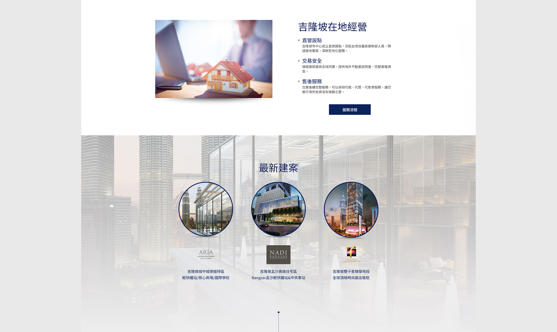
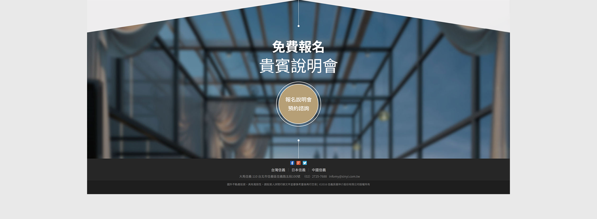
The overall site layout uses a steady, symmetrical design language with orderly structure and moderate whitespace to create a visual space of high quality and readability. Large image blocks are the main visuals, using textured, narrative corporate photos with concise slogans and transparent navigation so the screen stays attractive within its steadiness. The layout emphasizes clear layers and visual guidance, with information blocks arranged together and distracting content avoided to improve reading efficiency and usability. Spacing, fonts and colors in each block are finely tuned for a visual impression that is calm but not rigid, professional but not cold, fully reflecting the company’s trustworthiness and brand depth.

SEO
While pursuing refined, steady visual design, the site is also search-engine-friendly, with SEO planned from the underlying architecture. In content, the company’s core keywords are written in natural language into headings, subheadings and paragraphs, keeping meaning clear without overstuffing. Pages use semantic HTML tags with a clear H1 to H3 heading hierarchy, and each page has a representative meta title and description. Images carry ALT text and are compressed, balancing visual quality and loading speed. The site also supports responsive design for a consistent browsing experience on all devices, helping SEO scores and dwell time. The overall strategy aims to raise organic search rankings and strengthen the brand’s visibility and professional impression on digital platforms.
Seamless Experience On Mobile Devices
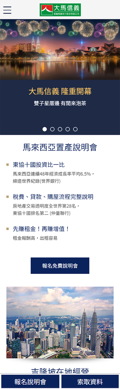
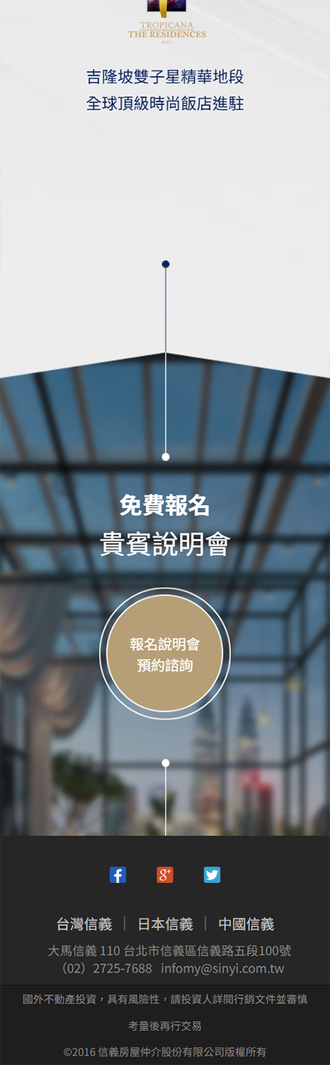
We use a Mobile-First design that starts from user habits and builds an intuitive interface for mobile devices, optimizing tap targets, layout and performance to ensure a consistent, smooth brand experience on every device.
Selected Cases
WORK