SiRUBA
SiRUBA
2025
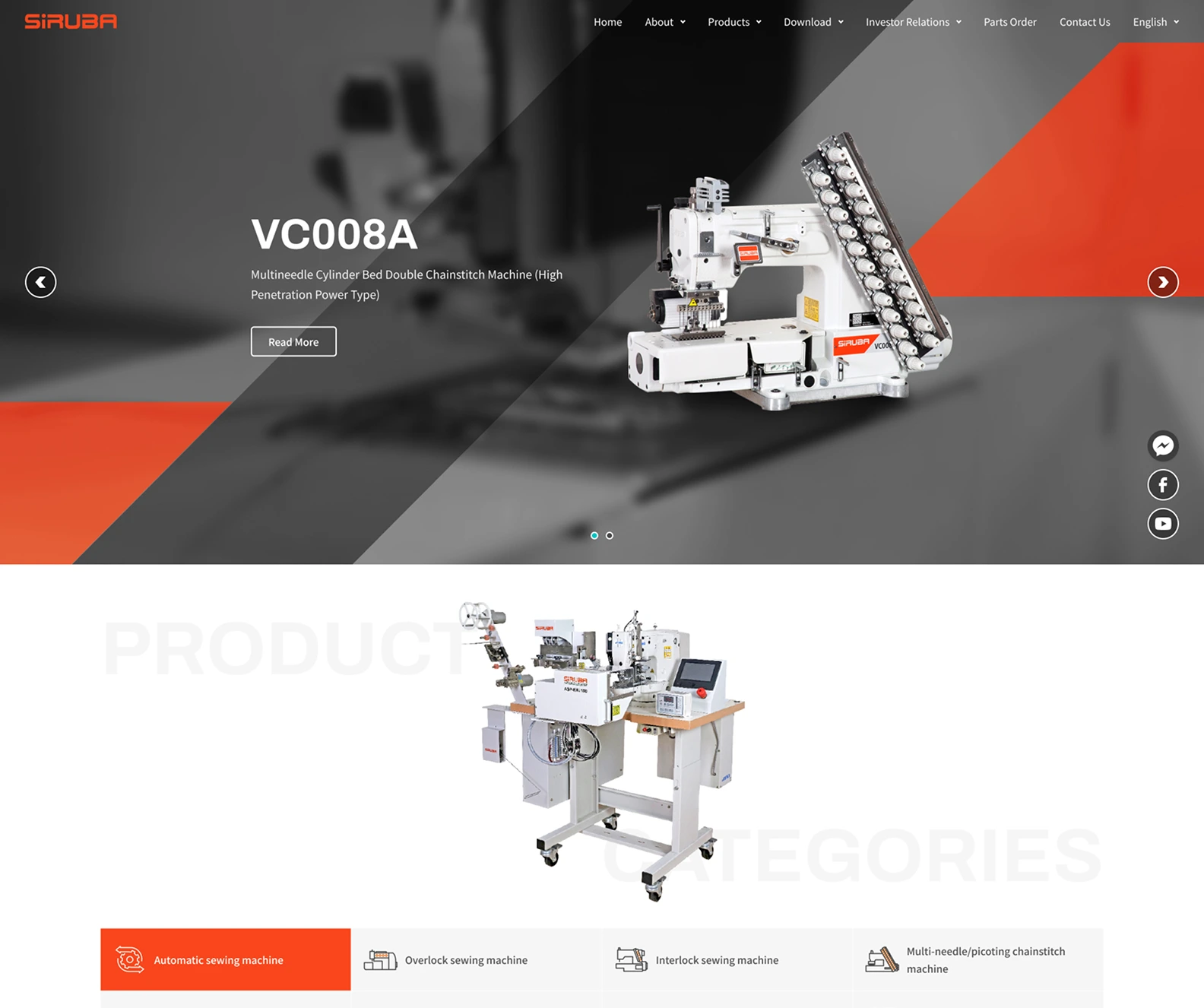


Corporate Identity Website
WordPress
Electronics, Computing & Manufacturing
Website Planning, Website Development, Traffic Analysis, User Behavior Analysis, Hosting Management, SEO


Founded in 1965, Siruba Co., Ltd. (stock code: 1531) is known worldwide for SiRUBA sewing machines. It develops and manufactures industrial sewing machines, including overlock, multi-needle, flatlock and lockstitch machines as well as electronic buttonhole, bartack and button-sewing machines, and leads the industry in automated sewing equipment.
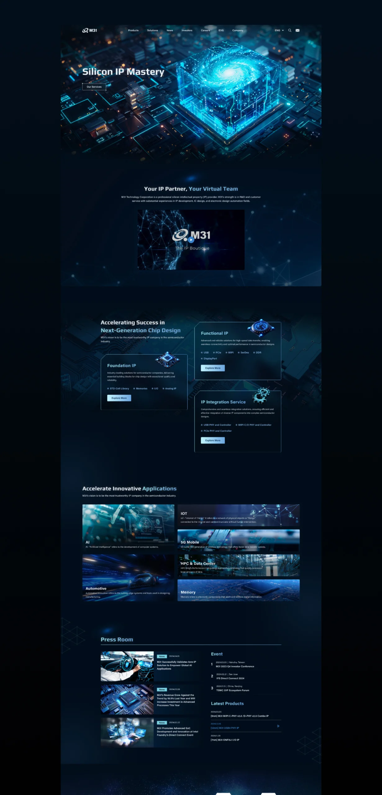
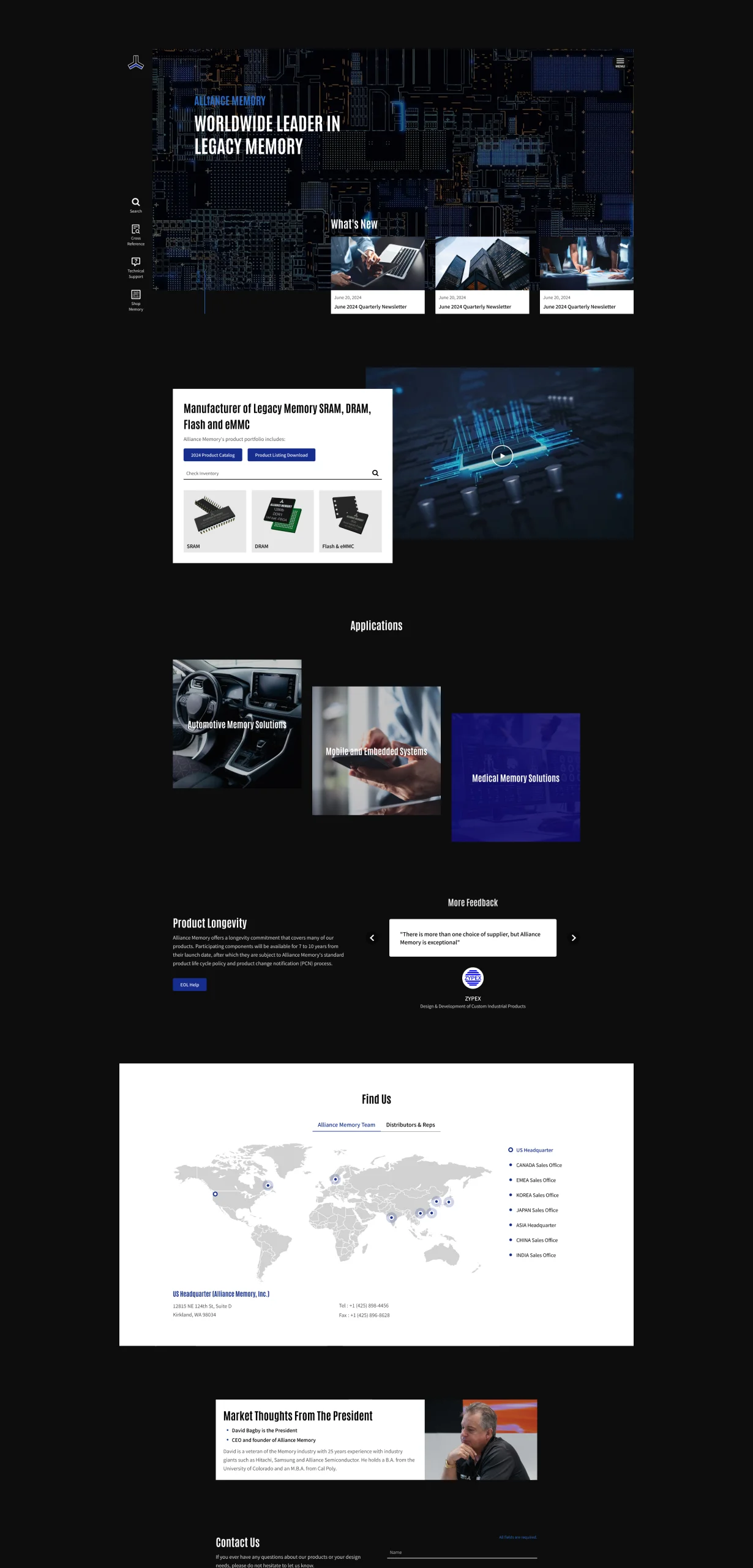
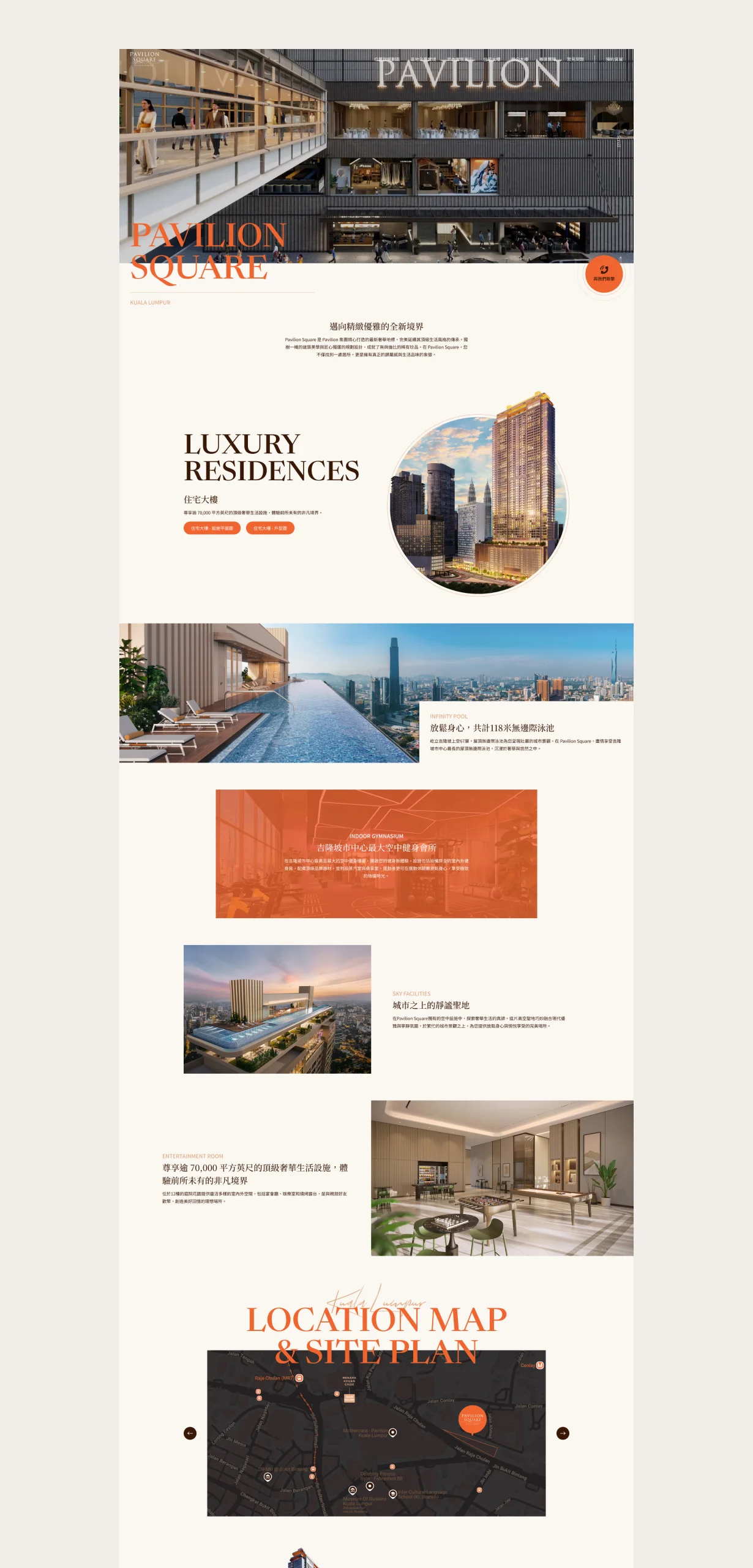
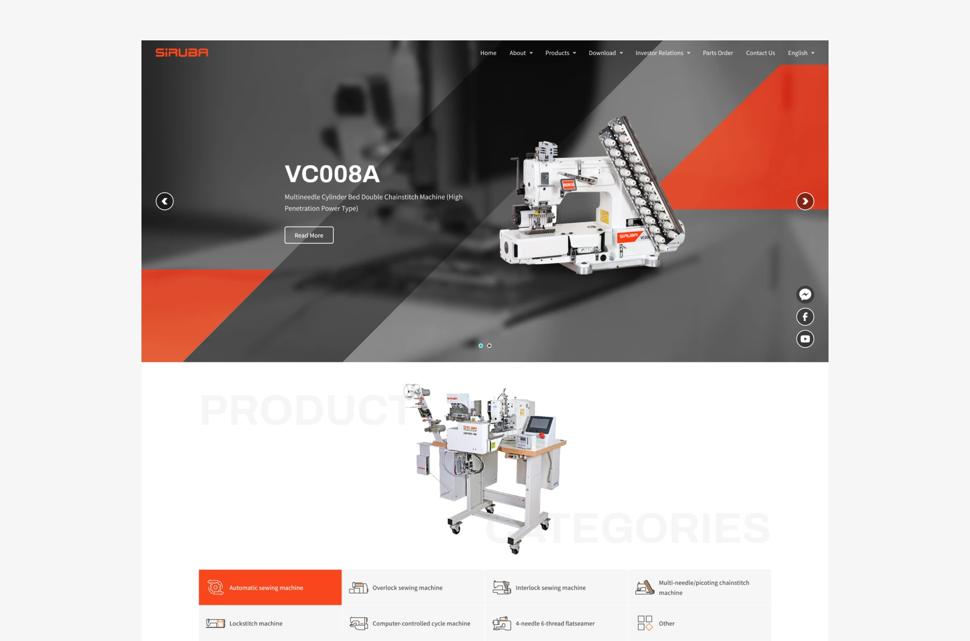
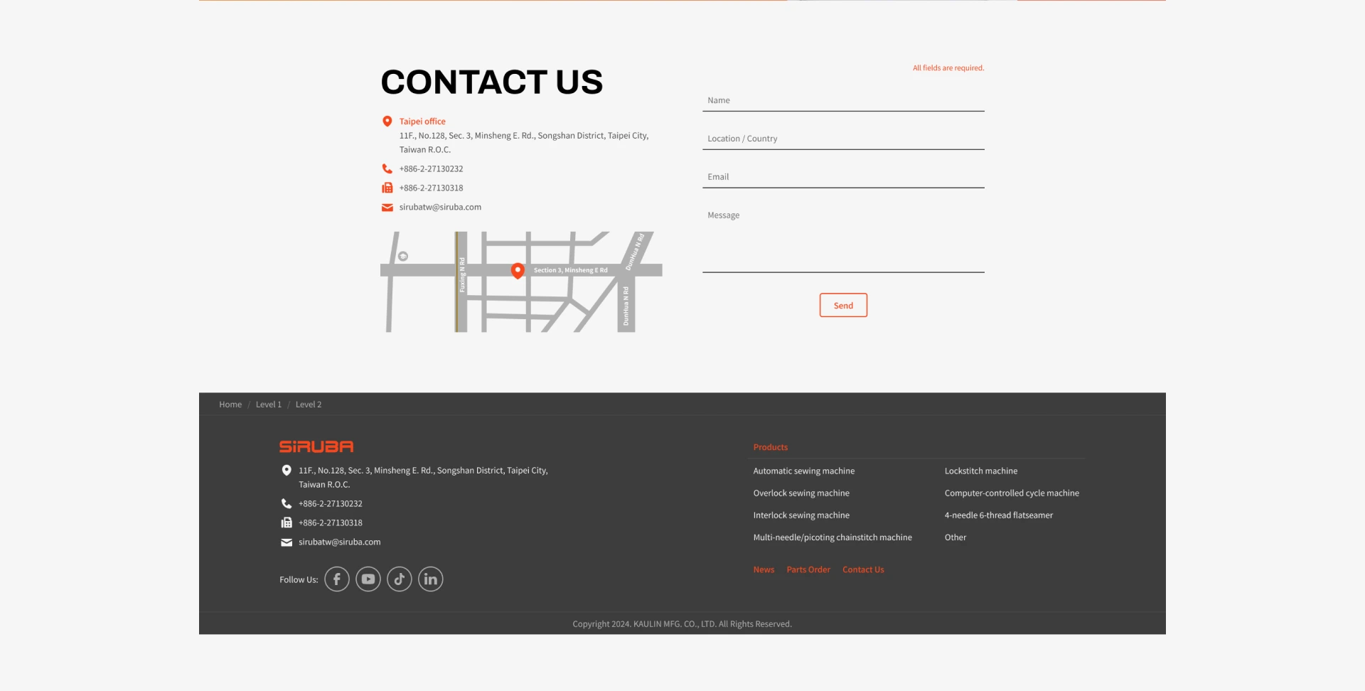
A square structure is the core visual tone, combined with the identifiable angled shape from the CI to plan an exclusive, varied layout. Rational geometry conveys the brand’s stability, while angled elements break the single frame to create visual tension that has both order and creativity. For color, dark tones are used as the background base, effectively adding layers and making key information and images more focused and prominent, further strengthening the site’s visual guidance. The overall mood conveys a steady, professional, trustworthy corporate brand image. This stylized design also raises the site’s uniqueness and brand recognition, making the visual language more consistent and recognizable and leaving a deep impression in a competitive market. This version focuses on showing the brand’s professional stature and visual differentiation, creating a highly representative digital storefront.


OUR STRATEGY

Content Architecture
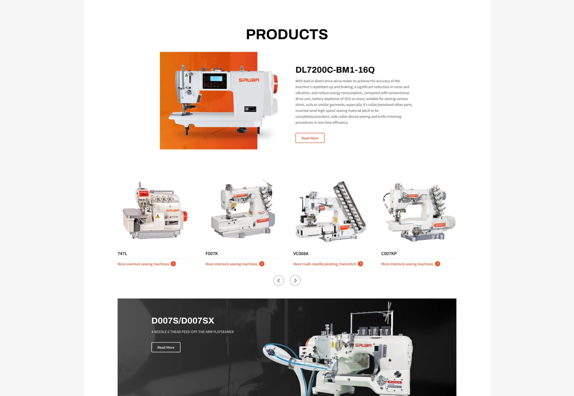
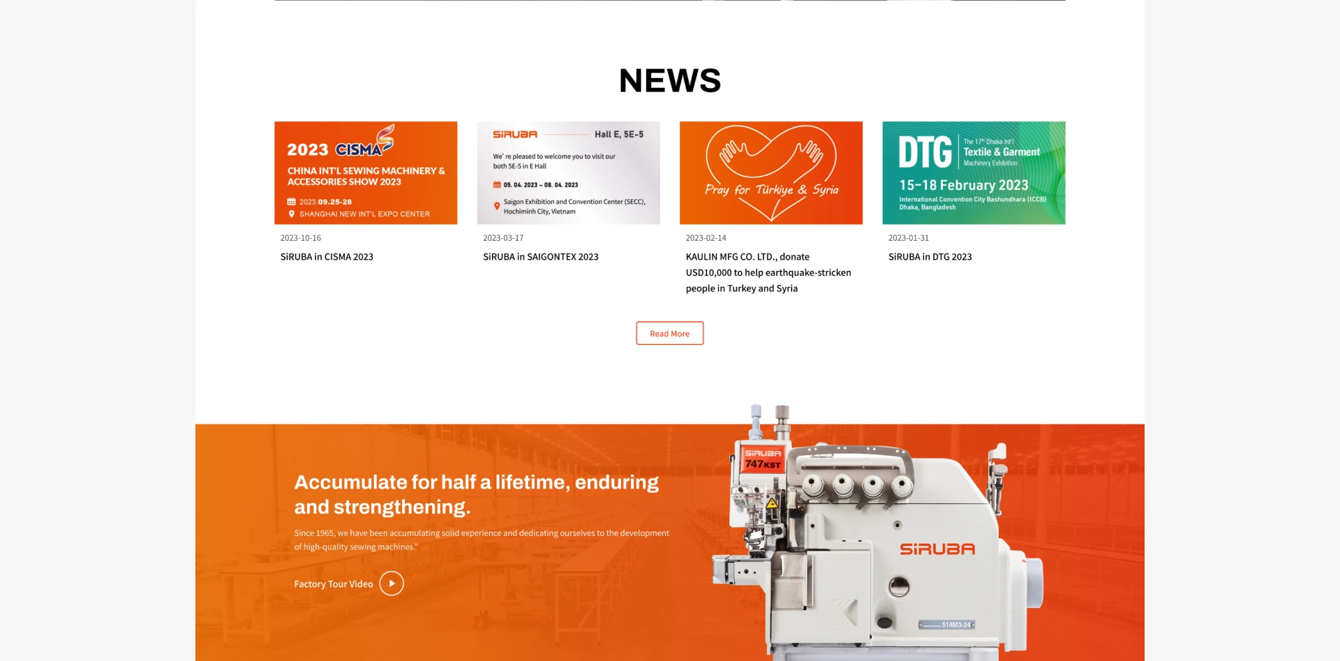
The overall content planning takes “steady professionalism” as its core, using a square structural vocabulary with the angled elements of the brand CI to create a clearly layered, rhythmic narrative. From the main visual to each paragraph of text, the user’s reading flow comes first so information is absorbed effectively in a short time. A dark background with clear text and image placement makes key content stand out, further strengthening the brand’s authority and stable image. The language style and visual expression are consistent, effectively improving readability and immersion so users naturally feel the brand’s value as they browse.

Layout Planning
The layout design starts from geometry and structure, embodying the brand’s visual language in every screen detail. It blends the angled design of the CI and breaks the rigid frame of the traditional square grid so the overall screen keeps dynamic tension within stability. The homepage focuses on building the first brand impression, using a large dark base to set off the logo and headline and convey trust and professionalism. Inner pages are clearly divided by content hierarchy, with attention to visual rhythm and reading efficiency from navigation logic to image-text arrangement. Subtle micro-interactions show delicate animation on mouse movement or element switching to strengthen user feedback. The overall layout balances visual consistency and user experience, raising the site’s quality and brand perception.

SEO
While strengthening visual expression and brand image, the site’s underlying architecture also takes search engine optimization into account. Pages use semantic HTML, with heading hierarchy, meta information and image alt text in place so search engines can correctly crawl and understand every content block. Every page has a descriptive title and description, and natural, effective copy is arranged around real search demand and brand keywords. Technically, image compression, lazy loading and code optimization effectively improve overall load speed and site performance. These foundational optimizations bring higher exposure and search rankings, strengthening the brand’s online visibility and organic traffic growth.
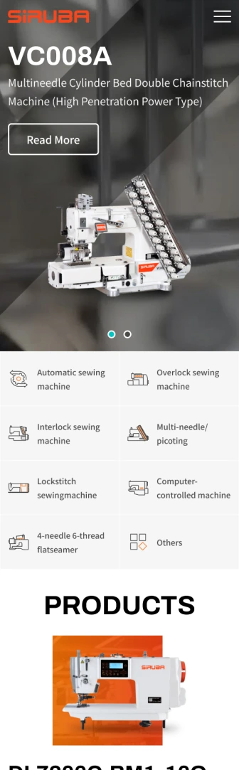
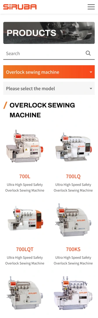
Seamless Experience On Mobile Devices
We use a Mobile-First design that starts from user habits and builds an intuitive interface for mobile devices, optimizing tap targets, layout and performance to ensure a consistent, smooth brand experience on every device.
Selected Cases
WORK